PlanningPME Desktop - List of evolutions
PlanningPME Desktop : Find out below the new features of our planning and scheduling solutions
PlanningPME ATRIA - Release date: 2024
Contents
Multiple choice
New date formats displaying day of the week
Display a field label in the description
Visual overview of the position of custom fields
Navigating tabs in list
Indicators : Addition of event status and contexts
New custom fields for projects : Project due date, Duration completed, Expected duration,
Other features
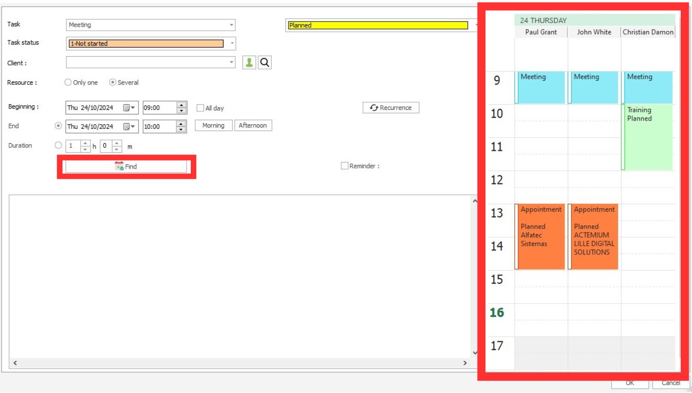
Scheduling assistant and search for availability of one or more resources
The scheduling and availability search assistant for one or more resources is a powerful tool developed to optimise time and resource management within an organisation.
It allows users to easily schedule tasks, appointments or projects by quickly finding available slots for one or more resources, whether employees, meeting rooms, or equipment.
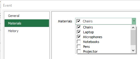
Multiple choice
New Custom Field Type : The "Multiple Choice" custom field type is a feature that allows users to create fields where multiple options can be selected simultaneously.
This field type is ideal for situations where a user needs to choose multiple items from a predefined list, such as selecting multiple pieces of equipment for an installation.
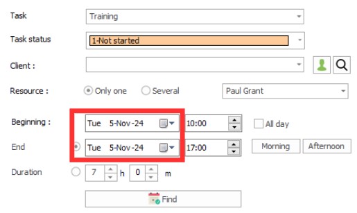
New date formats displaying day of the week
New date formats displaying the day have been added to better organise activities and coordinate schedules based on each day's specific habits and availability.
By including the day of the week with the date, for example "Mon 26-Aug-24", the user can more easily locate events in time.
To change the date format, go to the menu Tools User profile Short date.
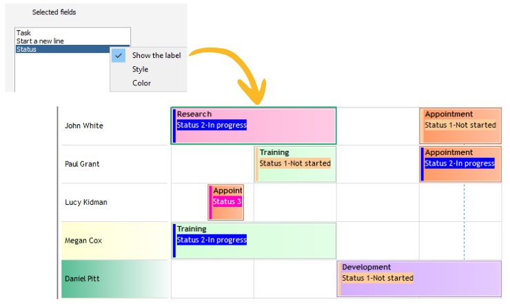
Display a field label in the description
Showing a field label in an event description means embedding the name or label of a specific field directly into the detailed description of the event.
This allows you to provide additional and contextual information about the event, such as the field name in front of a custom field of type "number", the field name of a comment field or any other relevant data associated with this event.
By including these labels, users can quickly identify key details without having to open the event, improving the clarity and efficiency of event management.
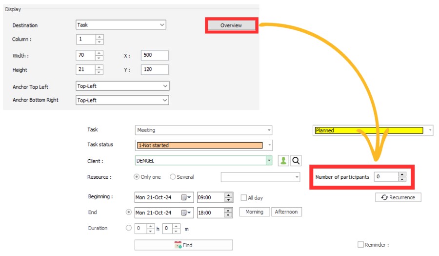
Visual overview of the position of custom fields
A Preview button has been added when creating custom fields
The position preview of custom field is a feature that allows users to graphically see where custom fields will appear in the event's "General" tab
This preview makes customisation easier by providing an overview of the organisation and layout of fields, helping to ensure that all information is laid out logically.
Navigating tabs in list
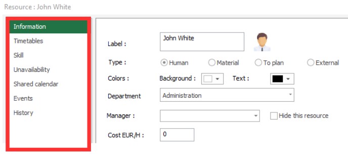
The tab navigation list is a feature that allows users to easily navigate between different tabs in a side menu
Indicators : Addition of event status and contexts
You can now create indicators for event status and contexts.
For example, you can display the number of people working remotely over a day. You can also have indicators to track Not Completed or Cancelled tasks for example.
New custom fields for projects : Project due date, Duration completed, Expected duration,
New custom project fields are now available : Project deadline, Duration completed, and Quantity.
. Project due date : This field allows you to define the deadline by which the project must be completed.. It is essential for planning and meeting deadlines, helping teams organise their work according to priorities and avoid delays.
. Duration achieved : This field records the time actually spent working on the project.. It is useful for assessing team efficiency and comparing time spent to planned time, which helps identify gaps, adjust strategies and improve resource management.
. Expected duration : This field indicates the estimated time to complete the project before it begins..
It serves as a reference for initial planning, helping to set realistic expectations and ensuring that resources are properly allocated to achieve objectives within the set timeframe.
These custom fields allow for more precise and tailored project management, providing detailed and relevant information for monitoring and analysis.
Other features
At the request of our customers, a number of changes have been made to the online schedule.
. Quick modification of a custom "choice" field : To save time, you can quickly modify an custom "Choice" field by right-clicking on the task.. Additional checking of resource availability : By default, if a resource is already occupied by a task or an unavailability, an alert message appears to prevent scheduling conflicts.. You have the option to give an additional restriction and have the alert message appear only if the resource is busy with an unavailability and not a task.
. List view saved in registry : When a user exits the schedule on the list view, this view is retained the next time the schedule is launched.
. Size of the custom field "Client Equipment" can be expanded : The "Client Equipment" custom field expands when you expand the Event window.
. Z-A sorting for custom fields of the type "Choice" : You can now list this type of field in descending alphabetical order.
. Number of additional signature fields : Need to sign an event multiple times
The number of additional fields of type "Signature" is now unlimited within an event.
. User history : From the Tools - History menu, it is possible to know the history by user
. Selecting a set of related tasks : It is now possible to select a set of linked tasks and then move them forward or backward.
. Deleting lines in task templates : It is now possible to delete rows in task templates
PlanningPME ORION - Release date: 2020
Contents
Improvement of the schedule loading
Manage the working context of your employees (remote-working, hours, etc)
Define the event status by default
Adapt the drawing space on the schedule
Follow the last connexions of your users on the schedule
New filter to sort resources directly on the planning board
Hierarchy of org-units: resource management through the organisation chart
Simplified management of your resources' time profiles
Tasks and unavailabilities status
Assigning a project to one or several departments
Customising the tasks list per department
New ergonomic task list
User-friendly multi-resource selection
Changing password through the new user profile menu
Customising the interface with your own labels
Planned vs achieved
Completion percentage of a event
Preview of the event
PlanningPME gets a new look
After a few weeks of work, we are happy to share with you that PlanningPME is about to be transformed! New logo, new colours and new product interfaces. We truly hope that you will appreciate this new, more refined and modern design which reflects the PlanningPME values.

Improvement of the schedule loading
The loading performance of the schedule has been significantly improved, allowing you to plan even faster.

Manage the working context of your employees (remote-working, hours, etc)
A context is a new type of data which enables to add a background context to the event schedule. A context is represented by a coloured rectangle in the background of the event scheduling.
You can use the context in different situations:
- Define the place where your employees are working everyday.
- Define working hours

Define the event status by default
You can define the event status by default. Then, while creating an event, this status will be selected by default.

Tutorial - Event management through the status
Adapt the drawing space on the schedule
New option available in the menu Tools -> Options -> View -> Additional drawing space.
Option activated: By activating this option, an empty zone appears above the task. This zone allows you to draw a new task by creating easily layered events.

Option desactivated: The event takes all the height of the line.

Follow the last connexions of your users on the schedule
From the menu Data -> Users menu, view the date of last connection for each user.

New filter to sort resources directly on the planning board
A new filter is now available to sort resources directly on the planning board.

You can now sort your resources depending on one of the following options:
- General order defined for all resources (Menu Data -> Resources)
- Resources order defined for each department (Menu Data -> Department)
Hierarchy of org-units: resource management through the organisation chart
The hierarchy of org-units enables the best possible organisation of your human and material resources.
- Create the organisation chart of your company
- Easily define the composition of each department
- Define the display order of your resources per department
- Assig time profile to a whole department with a single click
- Easily search among your resources
Simplified management of your resources' time profiles
Manage time profiles with the new Time profiles menu.

Then, in the Resource window, select the time profile to be assigned to the selected resource.

Tasks and unavailabilities status
For each status assigned to an event, a coloured visual mark displays on the left handside of the rectangle on the planning area according to the parameters you would have set beforehand.
Tutorial - Event management through the status
Assigning a project to one or several departments
You can now work on a project common to several departments.
Customising the tasks list per department
You can now define specific tasks for each department. Each department can define its own tasks list and thus wont see the labels its not concerned with.

New ergonomic task list
The list of tasks (Data Menu -> Tasks) has been improved: you can now directly see additional information such as skills, schedules, departments.

User-friendly multi-resource selection
Assigning several resources to an event is now made easier thanks to an ergonomic and user-friendly selection box.

Changing password through the new user profile menu
Each user can now define on his own the password he uses when accessing the planning.

Customising the interface with your own labels
For each language, you can now customise the labels to be used in the interface.
Planned vs achieved
For each event displayed on the planning area, you can specify a colour code that enables a quick tracking of planned vs achieved.
Completion percentage of a event
For each event, you can specify a completion percentage. A vertical dotted line shows the completion percentage.

Preview of the event
From now on you can preview the rendering of an event in the schedule according to your defined parameters.

PlanningPME LEO - Release date: 2016
Contents
Project window - 3 new additional tabs
Show only skilled resources when creating an event
Privacy: Possibility to hide text on absences and days off
Possibility to automatically adjust the height of the line
Copy / paste the style (colour of text and background) for multiple resources, clients and projects
Selecting fields to display in the search window
Plan a part of a task
When you move an event from the "To plan" panel area to a resource, a windows might display, asking you the duration of the task you want to schedule. This option is useful in the management of projects or long lasting tasks that needs to be split.

Project window - 3 new additional tabs
You can now create 3 new tabs in the project window.
To better adapt the schedule to your needs, you can now create up to 3 additional tabs with as many customised fields as you want.

Show only skilled resources when creating an event
If you select a task with assigned skills, you can now filter resources by skill directly on the event.
Pre-configuration: skills are assigned to resources and skills are assigned to the task's label.

Privacy: Possibility to hide text on absences and days off
For confidentiality purposes, a new "Description" / "Public" option is available in the groups, enabling to hide the text on the rectangle representing an event or unavailability / absence.

Possibility to automatically adjust the height of the line
A new option "Adjust the height of the line automatically" is available. When an employee does multiple tasks at the same time, the height of the line will increase on the schedule to enable better visibility.

Copy / paste the style (colour of text and background) for multiple resources, clients and projects
In order to easily and quickly set up the schedule, it is now possible to copy the colour of the text and the background of a resource, a client or a project and apply it on several resources / clients / projects all at once.

Selecting fields to display in the search window
You can select fields / columns you want to display in the research window as well as the year the query should be run on.

New interface
The PlanningPME interface has been fully redesigned for improved clarity, modernity and efficiency. The new ergonomy of our solution makes it easier to set up your schedule and navigate within it, saving valuable time and increasing performances.
Selection filters
Filters have also been redesigned to ensure an even more accurate display of the information you are looking for.
The list of different items available in each of your filters is still available via the search box which has moreover been improved with two new options:

- Select all: to select or deselect all in one click
- Empty: to display or hide records that do not contain any specific information for this filter.
Floating or fixed

Fixed or floating To plan resources are clearly identified on the schedule with specific layouts:
- Plain line for fixed,
- Dotted line for floating.
Clear Filter

This new filter enables you to clear all filter configurations by simply clicking the "Clear" option.
Create your Excel schedules within 1 click
Share PlanningPME calendars
Customisation of the appearance of the task
Filters
List View

Offline Mode
Read the tutorial

Dimensions
Read the tutorial
Indicators
Read the tutorial
History/Tracking improved:
Order your resources directly on the screen
Possibility to create customised data on the main tab:
Quick View of the extra fields on a new column
Follow the jobs done for each resource, client or project
Define a departmnet per project
Monthly recurrence
New kind of tasks : Assignments
Tutorial
Notifications in PlanningPME:
Tutorial
Agenda calendar view
Tutorial


